Discussion - Member to Member Sales - Research Center
Discussion - Member to Member Sales - Research Center

I was in love with that woman, and then she married that guy! At least I can still see her in one of my favourite movies, Rear Window.
Now, can we see something from your collection?
Bob

12 Members
like this post.
Login to Like.
That's a good idea Bob and a nice stamp to start the ball rolling. 
I like items that are a little out of the ordinary and here's one picked almost at random from the album I was working on.
This is an unused reply card from the Russian Post Offices in the Turkish Empire or Russian Levant.

This is the regular post card and its attached reply card also has a printed four kopek stamp.
11 Members
like this post.
Login to Like.
Bob,
Great idea for this thread! No restrictions: show something cool from your collection. Kind of a Show and Tell.
Regarding the stamp shown with the young lady: she might be out of your league. Haha!
Nigel,
Interesting piece. Also looks to be in very good condition!
Will try to dig something out that will raise an eyebrow.
Ernie
Login to Like
this post
Nepal running horse postal card. There are about a dozen different varieties of this postal card.

11 Members
like this post.
Login to Like.
I love it smauggie! What a great design.
Thanks for sharing this.
Login to Like
this post
Quite often noted as being a 'Mercury' or 'Hermes' essay these types are in fact just Stamp Exhibition souvenirs.
Printed by De La Rue for the 1923 International Stamp Exhibition held at the RHS Halls in London after a design competition of the Junior (now National) Philatelic Society.
Originally, 6 colours were issued, in the same colours as the (then) current definitives, but the organizers requested two sheets in Royal Purple and Gold from the printer to present to his Majesty King George V for his visit to the Exhibition on May 18th.
Copies on the open market have since proven that more than one sheet of each was printed but the number is not known. But these two colours are scarce and rarely seen.
The copy I am showing here was unlisted in the earlier British Stamp Exhibition catalogues but hopefully will appear in the later edition.
Royal Purple, No Watermark, Gummed.

10 Members
like this post.
Login to Like.
A 12/6 King George Keyplate paying the exit tax on a airline ticket. The passenger apparently arrived in Bermuda on September 9, 1952 and departed on September 15, 1952:

11 Members
like this post.
Login to Like.
Passengers had to pay a tax before they could leave in an airplane? Sounds like blackmail to me. Mind you, I have been on airplanes that I would have paid a great deal to deplane ASAP!
Bob
3 Members
like this post.
Login to Like.
My absolute favourite, which continued my special materials used for postage stamps: Toilet Paper!!! I also have 10K gold (Tierra del Fuego); wood (Spain) and Rayon Fabric (Canada)
9 Members
like this post.
Login to Like.
During World War I, the Berumda Government was asked by the Crown to raise taxes to support the war effort. One of the ways they complied with this request was to institute an "Exit Tax" of 5 shillings on every person leaving the Islands. In those days, it was almost exclusively by ship. There was a lot of concern at the time that the implementation of this new tax would adversely impact tourism. As is turned out it had no impact whatsoever. When the war ended the tax continued. Over the years it was increased from the original 5/ to 10/ then 12/6 and finally in the early 1050s to one pound.
Bermuda stopped using stamps to reflect payment of the tax in the mid-1950s. But, they still charged the tax, the burden of such collection falling on the shoulders of the shipping/cruising companies, as well as on those of the airlines. The tax continues to this day.
2 Members
like this post.
Login to Like.
These revenue stamps from New South Wales sport a rather ghostly visage of King Edward.

10 Members
like this post.
Login to Like.
Queensland 1p Orange S.38 (1868), perf. 13, watermarked Crown & Q

10 Members
like this post.
Login to Like.

06:24:08pm
One of my favourite stamps is the Bluenose stamp but the "man on the mast" variety is a bit special!

10 Members
like this post.
Login to Like.
This is my Bluenose. I'd actually prefer to have a similarly fresh-looking, well-centred stamp with a light parcel-post, roller-type cancellation, since the stamp was issued for use on parcels, but I'll keep this one, even though it was probably cancelled especially for a collector. This stamp doesn't have a "Man on the mast," but it does have a "Man on the mainsail". 

Bob
13 Members
like this post.
Login to Like.
My stamps and covers are for the most part common.
The more uncommon items are probably the banknotes I decided to add to the collection, like the one below.
Paid some $20 for the note which is also a used one , meaning it has been in Peru, just for the image of the jaguar on it that I like very much :-)


10 Members
like this post.
Login to Like.
Another Chalon head: 1885 5s S.76 Carmine Rose, Perf. 12, Watermarked Crown & Q sideways

10 Members
like this post.
Login to Like.
Jules, that's a gorgeous banknote. Love it!
I have already shown you guys most of the cool stamps in my album and also my budding postal history collection so I thought I would take a page from Jules' playbook and show you one from my banknote collection:

7 Members
like this post.
Login to Like.
12:23:35pm
Since we are away from stamps for a little bit here is an item I would definitely grab if I had to leave the house in a hurry! I know that folk art is an acquired taste but this is one of my favourite things!!

This is real, not a print!
6 Members
like this post.
Login to Like.


02:02:51pm
I don't blame you on that one Doug, great margins and colour! And who couldn't like a picture of a beaver? There's a lady in Mississippi who does beaver rescue and if I'm in a bad mood one of her videos is guaranteed to make me feel better!!
https://www.youtube.com/shorts/cBWkvZLma ...
3 Members
like this post.
Login to Like.
This is not a philatelic cover. Or, maybe it is. And isn’t.
A German-Canadian member of the British Columbia Philatelic Society, Horst “Harry” Tessman, sold me several covers that he had received from a friend with whom he corresponded during the Vietnam War. East Germany, of course, like most communist bloc nations, supported North Vietnam in its effort to unify North Vietnam and South Vietnam.

Since both Harry and his friend were stamp collectors, I have to assume that the franking of the cover was philatelic, but since the stamps paid for the transmission of personal correspondence they enjoyed non-philatelic use. This wasn't rare. I have four other covers bearing some of the same (and other) pro-North Vietnam GDR stamps, two covers used for regular mail within the GDR and two posted to Canada.
The stamp at the left, Scott 1301, is not related to the Vietnam War issues; issued in 1971, it commemorates the 8th Annual Congress of the Socialist Unity Party of Germany.
The other stamps, clockwise from the left, are B159, picturing Ho Chi Minh; B147, issued in 1968; B151, issued in 1969, and B161, issued in 1971. According to Scott, the surtax was "…for North Vietnam."
Bob
6 Members
like this post.
Login to Like.

Another Chalon type but Canadian ( )
)
1859 12 1/2 cent S.18 Yellow Green, wove paper, Perf 12., Unwmkd.
9 Members
like this post.
Login to Like.
Star and Bullseye on same cover - a bit ratty but unusual

Fairly early billboard advertising


9 Members
like this post.
Login to Like.
New South Wales postal card featuring the first stamp issued for New South Wales commemorating 50 years of postage stamp issuance in the colony.

8 Members
like this post.
Login to Like.
From my collection of St. Pierre & Miquelon.
Scott 50 with 2 double surchared stamps.

My understanding is the overprinted Sc 50 was surcharged with individual number hand stamps.
5 Members
like this post.
Login to Like.
Random stamp from my US collection, SC#300 of Benjamin Franklin

6 Members
like this post.
Login to Like.


8 Members
like this post.
Login to Like.
Sometimes the contents are more interesting than the covers. The envelope has a nice corner card from Alabastine Co in Grand Rapids Michigan. Inside was a pretty nice billhead showing the factory. Not particularly scarce but quite collectible. The other enclosure is an 8 panel brochure (double sided) with 140 year old paint chips as fresh as the day they were sent and a lot harder to find than the cover or billhead.


10 Members
like this post.
Login to Like.
WOW!
That is so cool.
I'd want that in my collection.
-Ari
P.S. Got to head to my stamp meeting now, maybe I will buy something cool to post here!!
Login to Like
this post
04:49:32pm
No offence Ari, but if I were Henry, this would never be sold - it's a real treasure!!! But, on the other hand, it never hurts to ask!
Login to Like
this post

8 Members
like this post.
Login to Like.
Interesting cover angore,
Please excuse this if its a dumb question but wouldn't this have been created during the Japanese occupation? Am I missing something here?
Login to Like
this post
It's torn, but it's a pretty thing, British Guiana 1929

9 Members
like this post.
Login to Like.
Moved from Vince's thread to Bob's:
On 15Nov, I'm scheduled to do a presentation to our local postal history club called, "The Gathering". Meetings held monthly on a Saturday at the Chester County Historical Society. Vince and Tom are members.
My topic is "The Seated Britannias printed by Perkins Bacon & Co"
I've been working on this collection for a few years, and it's up to more than 500 stamps, Barbados, Trinidad, and Mauritius - all of just two designs.
Why?
The impetus was to build on my study of the DWI bicolors, sorting them into individual printings (8-10 for each denomination).
Why?
Because it is not possible to sort the Seated Britannia into individual printings...or "commmissions", using the Scott or SG catalogs.
Sorting the Seated Britannias into individual printings (or, commissions), is an order of magnitude more complex!
There were 44 commissions to Barbados 1850-1873, 22 commissions to Trinidad, 1851-1861.
Again, these stamps are all from just two designs. And the two designs were each printed from a single plate.
Cutting to the chase:
One of the novel areas I'm exploring is cancelling device usage date ranges (there were 5 different devices used in Barbados). This helps to sort the stamps into commissions, and I've not seen it explored in detail.
Here's an image I'll use:

The 1s. stamp on the right, from the Second Design shows the "broken 1" variety on the bootheel cancelling device used in the GPO in Bridgeton. It is a known variety. The 1p (denominated by color) stamp on the left is of the First Design. It appears to show the same "broken 1", but in a slightly better (earlier) state of repair. You can see the crack, diagonally across the vertical part of the "1", but the upper piece has not yet fallen out of the device. And, you can see a crumb at the lower left of the "1", which may be errant residue (a broken piece) wedged in there.
These two stamps were both from Commission 38, invoiced by Perkins Bacon on 11-13-1869. The perfs are trimmed from the 1s. stamp (probably because the "rough" perforations could not be pulled apart). If we can presume that a broken cancelling device would normally remain in service for only short period of time, then they can be useful in grouping stamps into printings (commissions). These were some of the first cancelling devices ever used on postage stamps, and in general, they would last only a couple of years in heavy service. In the 1870s, Barbados was using 500-700 1p stamps a day, the vast majority at the Bridgeton GPO. So, cancelling devices deteriorated rapidly there. If one looks at enough stamps, the relative age of cancelling devices can be crudely discerned by observing at how 'dirty' the cancels are. How much crud has accumulated in the recesses.
Going further, I might assert that the cancellations on the two stamps in the image were applied the same day...by the same clerk! Because the cancellation is 'clocked' the same way on each stamp. And, because of the break in the "1" it could not have lasted very long. The digits were replaceable - IF they had replacements on hand!
Any other Perkins Bacon enthusiasts on SOR?
This presentation will probably end up on youtube in a few months, so stay tuned!
-Paul
6 Members
like this post.
Login to Like.
Mauritius
1859 SG.40 no value blue

7 Members
like this post.
Login to Like.
banknoteguy,
I believe your stamp is SG#31, a stamp which was prepared for use but never issued.
They have an interesting story.
No value stamps in red-brown and blue were ordered from Perkins Bacon but never issued. The bulk of the issue was returned to PB and the remainders (between 2-3,000) were used for souvenirs at the 1890 Stamp Exhibition held in the Portman Rooms, Baker Street, London. They were perforated at the event by Perkins Bacon themselves and overprinted by M.P.Castle.
They had quite a journey !!
Now a few of those reside here in Israel and one of them is shown below. From London to Mauritius to London to Israel and probably many other places in between !! The fun of collecting.

Above, a very scarce double overprint example.
Londonbus1
7 Members
like this post.
Login to Like.
"Please excuse this if its a dumb question but wouldn't this have been created during the Japanese occupation? Am I missing something here?"
It does not appear that the Japanese ended the postal system but allowed it to operate. They obviously approved stamps, ran a censor operation. etc. Stamps were issued, first days were commemorated, cancellations were customized, etc.
I have a bunch of covers.

7 Members
like this post.
Login to Like.
angore,
Thanks for the follow up. I find that quite striking really. There is a great deal of history in those covers. Thank you for sharing those.
Ernie
2 Members
like this post.
Login to Like.
@ londonbus:
Thank's for the great info on the "remainders" as they were commonly called. What you describe is referred to by Bacon and Napier in their late 1890s handbooks as "The Great Haul", when a great quantity of unused product came into the hands of collectors by unofficial means.
I don't think I've seen it documented, but allegedly, Perkins Bacon lost their contracts with Trinidad, and eventually Barbados because of poor accounting for these remainders. It's incredible, given that the vast majority of Perkins' printing experience was with banknotes. Why he didn't recognize that stamps were equivalent to banknotes in their accountability is a mystery. But, there were lots of sources of "remainders". The common commission was for 100,000 stamps. With sheets of 110 stamps (10 rows of 11). that's 909 sheets...plus ONE row. What happened to the other 99 stamps that were printed? Perkins Bacon got dinged for poor accounting of the Realm's property.
Also, there was one person accountable for perforating stamps at Perkins Bacon. That was the "Miss Stewart" of lore...Her daily records survive, but if you compare them to the printing records, they often don't align perfectly. Some slop there. I have to expect that individual sheets were 'spoiled' during the VERY cumbersome perforation process. And then, discarded. She made records of perforating up to 1800 sheets a day! That is truly incredible, considering that EACH sheet required 23 passes to be fully perforated! And, there was only ever one perforating machine in use. Perkins Bacon tried to get Inland Revenue to perf the stamps for them at Somerset House, with the very fine comb perforator they had, but was apparently rebuffed when Perkins Bacon needed that support the most. That's what spawned the pin perfs.
More practically, the "mint" stamps are often of widely divergent shades than "used" stamps. To me, this suggests that someone was scrutinizing ink colors, and rejecting sheets that were too divergent from the 'standard', which was probably a soft one to begin with, given production pressures. Remember, there was only one plate produced for the First Issue, and one each for each denomination (6p, 1s) of the Second Issue. As I understand the process, the plate was inked and then hand-wiped with a rag between EACH sheet. At top levels of production, they were printing a sheet every 20 seconds in a 10-hour day.
I think, "How the hell...?!" Under that kind of quota pressure, hybrid ink colors could be expected, as they switched to different ink colors on that plate, or the wiping process got perfunctory. (Can you imagine the size of the pile of dirty, highly flammable rags at the end of each day?) In some commissions, you see evidence of this, with the ink color bleeding over into the margins, particularly the right margin of the blue 1p stamps. That's another ID hint!
I think there were two guys running the press. One guy was responsible for slinging ink and paper, the other guy supervised and helped with the press.
There are 10-20 different men who signed off on the daily printing records over the 15-year period I've looked at. You would have to expect various levels of expertise across 10-20 two-man crews. Remember, it was ALL done by hand. No steam power, either.
For the earliest issues, the guy who chose and described the colors seems to certainly have been colorblind. There was confusion in the correspondence over stamp colors!
More than you ever wanted to know about early stamp production. It's a fascinating area of research!
-Paul
5 Members
like this post.
Login to Like.
also @londonbus,
You state that the sheets were perforated at the 1890 show by Perkins, Bacon. I would agree that they were probably all printed by Perkins, Bacon. But, Perkins Bacon used a 12.5 perforator only on the halfpenny and 4p stamps of Commission 41 (July, 1872).These 12.5 perforations were ONLY done on the horizontal edges because that was the only way the printed sheets would fit in the throat of that perforator (the Francis machine). The 12.5 perfs done by that machine were very crude indeed.
Here are my EDK and LDK for those two "compound" perforated stamps:

It's not hard to see that the top and bottom perfs on these stamps were done by a different machine than the perfs on the 1890 favors.
ALSO, note how clean-cut the side perfs are on these stamps. This was the first commission perforated on the stand-by Griffiths perforator after it was overhauled in July 1872. During that overhaul, the new pins were set to a gauge 15. So for ID, these two stamps make GREAT reference material to accurately determine whether perfs were 'pre-' or 'post' overhaul.
I suggest that De La Rue was actually at the 1890 show, doing those perforations. I think that Perkins Bacon was pretty much out of the colonial commission business by that date. But, that's beyond the scope of my research, so I defer...
-Paul
2 Members
like this post.
Login to Like.
@banknoteguy
Wanted to back up my claim that colors of mint stamps are not representative of issued stamps.
Sorry I'm barfing all over your thread, Bob. I should have started a new one.
I am really charged up on this topic right now, because I've spent a couple of years on it, and the last couple of months have really been intense, working up to this presentation...
Here is a mint strip that I got for a very low price, with full, original gum. One tiny hinge remnant:

I bought it to show the horizontal misalignment of the top and bottom edges of the design. And, it's a margin strip, so it shows how much leeway they had in getting the sheet of paper centered on the plate before they printed it.
Color is unlike any other blue stamp - much darker, almost a midnight blue. It is probably a remainder printed with Consignment 12, the only printing in 1856 and the first one on paper that wouldn't blue.
Blue 1p stamps were, by far, the most widely used denomination all the way across this time period, because it was the letter rate for intra-island mail. Half of all the Barbados seated Britannias were blue stamps. Blue stamps were often fully depleted by the time a new commission arrived, because it took 2 or 3 months for the commission to be received (by packet mail), printed, and then shipped to Barbados. Also, in the early years, they had to predict usage rates. Later on, they could estimate them more closely from experience.
Also, for your viewing pleasure is this NICE halfpenny pair, postally used on piece, probably from Consignment 14 (1857):

Of course, the halfpenny pair would substitute for a single 1p blue. I really like this item because it illustrates the misalignment of individual images on the plate. See that tiny green line at the top edge?
-Paul
3 Members
like this post.
Login to Like.
pigdoc,
Paul, I will get back to you about your theory via a SOR message this weekend. But it's time to get back on track for this very nice and popular thread.
And where better to get it going than in London 1910 !! And with Perkins Bacon no less !
My very favourite Philatelic Congress of Great Britain item is from the 2nd Congress held at Caxton Hall in London. I adore this image of Her Majesty, not often seen and as far as I can recall only appears elsewhere on a Ceylon Foreign Bill Revenue from 1862.
These are not seen too often and when they are, can be quite pricey. Imperfs also exist and are even more scarce. An Imperf pair in blue was posted on 'The Stamp Forum' this morning and it was great to see. There also exists proofs in black.


The set of 4 was made available to delegates at the Congress.
Londonbus1
8 Members
like this post.
Login to Like.

5 Members
like this post.
Login to Like.
angore, trying to figure out what might have happened with this card. The main US and Filipino forces withdrew to the Bataan Peninsula in early January, 1942. Wondering what the black markings are over the crest and the top of the stamp. The cancel looks very American.
Login to Like
this post
@Ernieinjax
All references to the United States were blocked out.
On the left the Territorial Seal and on the "stamp" the words United States of America.
Can't remember what is under the horizontal bar in the center.
The Japanese occupation forces did the same for individual stamps.
1 Member
likes this post.
Login to Like.
@Charlie, gotcha. Makes perfect sense.
Login to Like
this post
'Commonwealth' is under the horizontal bar in the centre.
2 Members
like this post.
Login to Like.
Another philatelic cover. It had contents but sent registered mail per marks on backside.

8 Members
like this post.
Login to Like.
Scott No. N8

4 Members
like this post.
Login to Like.
Early Hop Merchant envelope and letterhead from Milford NY

9 Members
like this post.
Login to Like.
A pretty nice 1851 1c Blue S.7 (pos 98L2):

7 Members
like this post.
Login to Like.

Not a stamp but a painting I picked up earlier this year. A great addition to my stamp office.
10 Members
like this post.
Login to Like.

A scarce and rarely seen entry programme to the 1908 Stamp Exhibition in London organized by the Junior Philatelic Society. The event was held at Caxton Hall in Westminster.
The cover is delightful in showing the connection between love and Philately with the help of the 'Tete-Beche' terminology.
Love it !
Londonbus1
6 Members
like this post.
Login to Like.
1954 Around Australia REDeX Reliability Car Trial


8 Members
like this post.
Login to Like.
That is a lovely card !!
Login to Like
this post
Great stuff!
The thread is starting to get to large for my computer to load!
Login to Like
this post
U.S. 5c James Garfield S.216P3 Blue, Proof large banknote on India paper, imperf (no gum as issued):

Compared with a regular issue S.216

7 Members
like this post.
Login to Like.
Great Garfield proof, Jack. I've thought about buying proofs, but haven't done it yet. A slippery slope!
Here a recent acquisition, purchased to help illustrate a web page about the post office in Arenas Valley, New Mexico, which was and still is known by residents as Whiskey Creek. My family moved to Arenas Valley from Savona, in New York State's Southern Tier, in 1949.

Bob
7 Members
like this post.
Login to Like.
Norman Morrison was a Vietnam War protester and Quaker who immolated himself below the office of Secretary of Defense Robert McNamara at the Pentagon.
This cover is partially franked with a stamp issued by North Vietnam in honour of Morrison only 23 days after his death.

My friend Trevor Larden, who died recently, was a member and former president of my stamp club, the British Columbia Philatelic Society. I displayed the cover shown above at a stamp club meeting, Trevor was amazed. He had not been aware of the North Vietnamese stamp, and he had met Morrison and his wife, Anne Welsh, who was also a Quaker, when they were all travelling in the eastern Mediterranean in the early late 1950s or early 1960s. Trevor had taken a photograph of the couple, and promised to give me a copy. Here it is:

It's amazing how "personal" stamps and postal history can become when you learn about their provenance.
Bob
10 Members
like this post.
Login to Like.
Recently acquired Canada, 1975, Canadian Ships (1)


4 Members
like this post.
Login to Like.

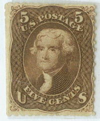
I have so many images of my stamps, covers, etc. that you will never see unless I show them to you! Here is my first:
I was in love with that woman, and then she married that guy! At least I can still see her in one of my favourite movies, Rear Window.
Now, can we see something from your collection?
Bob
12 Members
like this post.
Login to Like.

re: Random picks from our collections
That's a good idea Bob and a nice stamp to start the ball rolling.
I like items that are a little out of the ordinary and here's one picked almost at random from the album I was working on.
This is an unused reply card from the Russian Post Offices in the Turkish Empire or Russian Levant.
This is the regular post card and its attached reply card also has a printed four kopek stamp.
11 Members
like this post.
Login to Like.

re: Random picks from our collections
Bob,
Great idea for this thread! No restrictions: show something cool from your collection. Kind of a Show and Tell.
Regarding the stamp shown with the young lady: she might be out of your league. Haha!
Nigel,
Interesting piece. Also looks to be in very good condition!
Will try to dig something out that will raise an eyebrow.
Ernie
Login to Like
this post

re: Random picks from our collections
Nepal running horse postal card. There are about a dozen different varieties of this postal card.
11 Members
like this post.
Login to Like.
re: Random picks from our collections
I love it smauggie! What a great design.
Thanks for sharing this.
Login to Like
this post

re: Random picks from our collections
Quite often noted as being a 'Mercury' or 'Hermes' essay these types are in fact just Stamp Exhibition souvenirs.
Printed by De La Rue for the 1923 International Stamp Exhibition held at the RHS Halls in London after a design competition of the Junior (now National) Philatelic Society.
Originally, 6 colours were issued, in the same colours as the (then) current definitives, but the organizers requested two sheets in Royal Purple and Gold from the printer to present to his Majesty King George V for his visit to the Exhibition on May 18th.
Copies on the open market have since proven that more than one sheet of each was printed but the number is not known. But these two colours are scarce and rarely seen.
The copy I am showing here was unlisted in the earlier British Stamp Exhibition catalogues but hopefully will appear in the later edition.
Royal Purple, No Watermark, Gummed.
10 Members
like this post.
Login to Like.

re: Random picks from our collections
A 12/6 King George Keyplate paying the exit tax on a airline ticket. The passenger apparently arrived in Bermuda on September 9, 1952 and departed on September 15, 1952:
11 Members
like this post.
Login to Like.
re: Random picks from our collections
Passengers had to pay a tax before they could leave in an airplane? Sounds like blackmail to me. Mind you, I have been on airplanes that I would have paid a great deal to deplane ASAP!
Bob
3 Members
like this post.
Login to Like.
11:21:34am
re: Random picks from our collections
My absolute favourite, which continued my special materials used for postage stamps: Toilet Paper!!! I also have 10K gold (Tierra del Fuego); wood (Spain) and Rayon Fabric (Canada)
9 Members
like this post.
Login to Like.
re: Random picks from our collections
During World War I, the Berumda Government was asked by the Crown to raise taxes to support the war effort. One of the ways they complied with this request was to institute an "Exit Tax" of 5 shillings on every person leaving the Islands. In those days, it was almost exclusively by ship. There was a lot of concern at the time that the implementation of this new tax would adversely impact tourism. As is turned out it had no impact whatsoever. When the war ended the tax continued. Over the years it was increased from the original 5/ to 10/ then 12/6 and finally in the early 1050s to one pound.
Bermuda stopped using stamps to reflect payment of the tax in the mid-1950s. But, they still charged the tax, the burden of such collection falling on the shoulders of the shipping/cruising companies, as well as on those of the airlines. The tax continues to this day.
2 Members
like this post.
Login to Like.
re: Random picks from our collections
These revenue stamps from New South Wales sport a rather ghostly visage of King Edward.
10 Members
like this post.
Login to Like.

re: Random picks from our collections
Queensland 1p Orange S.38 (1868), perf. 13, watermarked Crown & Q
10 Members
like this post.
Login to Like.
Back when I had a bunch! I think, therefore I am - I think! Descartes, sort of!
29 Oct 2025
06:24:08pm
re: Random picks from our collections
One of my favourite stamps is the Bluenose stamp but the "man on the mast" variety is a bit special!
10 Members
like this post.
Login to Like.
re: Random picks from our collections
This is my Bluenose. I'd actually prefer to have a similarly fresh-looking, well-centred stamp with a light parcel-post, roller-type cancellation, since the stamp was issued for use on parcels, but I'll keep this one, even though it was probably cancelled especially for a collector. This stamp doesn't have a "Man on the mast," but it does have a "Man on the mainsail".
Bob
13 Members
like this post.
Login to Like.

Approvals
re: Random picks from our collections
My stamps and covers are for the most part common.
The more uncommon items are probably the banknotes I decided to add to the collection, like the one below.
Paid some $20 for the note which is also a used one , meaning it has been in Peru, just for the image of the jaguar on it that I like very much :-)
10 Members
like this post.
Login to Like.
re: Random picks from our collections
Another Chalon head: 1885 5s S.76 Carmine Rose, Perf. 12, Watermarked Crown & Q sideways
10 Members
like this post.
Login to Like.
re: Random picks from our collections
Jules, that's a gorgeous banknote. Love it!
I have already shown you guys most of the cool stamps in my album and also my budding postal history collection so I thought I would take a page from Jules' playbook and show you one from my banknote collection:
7 Members
like this post.
Login to Like.
Back when I had a bunch! I think, therefore I am - I think! Descartes, sort of!
30 Oct 2025
12:23:35pm
re: Random picks from our collections
Since we are away from stamps for a little bit here is an item I would definitely grab if I had to leave the house in a hurry! I know that folk art is an acquired taste but this is one of my favourite things!!
This is real, not a print!
6 Members
like this post.
Login to Like.
Back when I had a bunch! I think, therefore I am - I think! Descartes, sort of!
30 Oct 2025
02:02:51pm
re: Random picks from our collections
I don't blame you on that one Doug, great margins and colour! And who couldn't like a picture of a beaver? There's a lady in Mississippi who does beaver rescue and if I'm in a bad mood one of her videos is guaranteed to make me feel better!!
https://www.youtube.com/shorts/cBWkvZLma ...
3 Members
like this post.
Login to Like.
re: Random picks from our collections
This is not a philatelic cover. Or, maybe it is. And isn’t.
A German-Canadian member of the British Columbia Philatelic Society, Horst “Harry” Tessman, sold me several covers that he had received from a friend with whom he corresponded during the Vietnam War. East Germany, of course, like most communist bloc nations, supported North Vietnam in its effort to unify North Vietnam and South Vietnam.
Since both Harry and his friend were stamp collectors, I have to assume that the franking of the cover was philatelic, but since the stamps paid for the transmission of personal correspondence they enjoyed non-philatelic use. This wasn't rare. I have four other covers bearing some of the same (and other) pro-North Vietnam GDR stamps, two covers used for regular mail within the GDR and two posted to Canada.
The stamp at the left, Scott 1301, is not related to the Vietnam War issues; issued in 1971, it commemorates the 8th Annual Congress of the Socialist Unity Party of Germany.
The other stamps, clockwise from the left, are B159, picturing Ho Chi Minh; B147, issued in 1968; B151, issued in 1969, and B161, issued in 1971. According to Scott, the surtax was "…for North Vietnam."
Bob
6 Members
like this post.
Login to Like.
re: Random picks from our collections
Another Chalon type but Canadian ()
1859 12 1/2 cent S.18 Yellow Green, wove paper, Perf 12., Unwmkd.
9 Members
like this post.
Login to Like.
08:39:27pm
re: Random picks from our collections
Star and Bullseye on same cover - a bit ratty but unusual
Fairly early billboard advertising
9 Members
like this post.
Login to Like.
re: Random picks from our collections
New South Wales postal card featuring the first stamp issued for New South Wales commemorating 50 years of postage stamp issuance in the colony.
8 Members
like this post.
Login to Like.

re: Random picks from our collections
From my collection of St. Pierre & Miquelon.
Scott 50 with 2 double surchared stamps.
My understanding is the overprinted Sc 50 was surcharged with individual number hand stamps.
5 Members
like this post.
Login to Like.

re: Random picks from our collections
Random stamp from my US collection, SC#300 of Benjamin Franklin
6 Members
like this post.
Login to Like.

re: Random picks from our collections
8 Members
like this post.
Login to Like.
10:08:47am
re: Random picks from our collections
Sometimes the contents are more interesting than the covers. The envelope has a nice corner card from Alabastine Co in Grand Rapids Michigan. Inside was a pretty nice billhead showing the factory. Not particularly scarce but quite collectible. The other enclosure is an 8 panel brochure (double sided) with 140 year old paint chips as fresh as the day they were sent and a lot harder to find than the cover or billhead.
10 Members
like this post.
Login to Like.

Approvals
re: Random picks from our collections
WOW!
That is so cool.
I'd want that in my collection.
-Ari
P.S. Got to head to my stamp meeting now, maybe I will buy something cool to post here!!
Login to Like
this post
Back when I had a bunch! I think, therefore I am - I think! Descartes, sort of!
04 Nov 2025
04:49:32pm
re: Random picks from our collections
No offence Ari, but if I were Henry, this would never be sold - it's a real treasure!!! But, on the other hand, it never hurts to ask!
Login to Like
this post
re: Random picks from our collections
8 Members
like this post.
Login to Like.
re: Random picks from our collections
Interesting cover angore,
Please excuse this if its a dumb question but wouldn't this have been created during the Japanese occupation? Am I missing something here?
Login to Like
this post

re: Random picks from our collections
It's torn, but it's a pretty thing, British Guiana 1929
9 Members
like this post.
Login to Like.
01:37:53pm
re: Random picks from our collections
Moved from Vince's thread to Bob's:
On 15Nov, I'm scheduled to do a presentation to our local postal history club called, "The Gathering". Meetings held monthly on a Saturday at the Chester County Historical Society. Vince and Tom are members.
My topic is "The Seated Britannias printed by Perkins Bacon & Co"
I've been working on this collection for a few years, and it's up to more than 500 stamps, Barbados, Trinidad, and Mauritius - all of just two designs.
Why?
The impetus was to build on my study of the DWI bicolors, sorting them into individual printings (8-10 for each denomination).
Why?
Because it is not possible to sort the Seated Britannia into individual printings...or "commmissions", using the Scott or SG catalogs.
Sorting the Seated Britannias into individual printings (or, commissions), is an order of magnitude more complex!
There were 44 commissions to Barbados 1850-1873, 22 commissions to Trinidad, 1851-1861.
Again, these stamps are all from just two designs. And the two designs were each printed from a single plate.
Cutting to the chase:
One of the novel areas I'm exploring is cancelling device usage date ranges (there were 5 different devices used in Barbados). This helps to sort the stamps into commissions, and I've not seen it explored in detail.
Here's an image I'll use:
The 1s. stamp on the right, from the Second Design shows the "broken 1" variety on the bootheel cancelling device used in the GPO in Bridgeton. It is a known variety. The 1p (denominated by color) stamp on the left is of the First Design. It appears to show the same "broken 1", but in a slightly better (earlier) state of repair. You can see the crack, diagonally across the vertical part of the "1", but the upper piece has not yet fallen out of the device. And, you can see a crumb at the lower left of the "1", which may be errant residue (a broken piece) wedged in there.
These two stamps were both from Commission 38, invoiced by Perkins Bacon on 11-13-1869. The perfs are trimmed from the 1s. stamp (probably because the "rough" perforations could not be pulled apart). If we can presume that a broken cancelling device would normally remain in service for only short period of time, then they can be useful in grouping stamps into printings (commissions). These were some of the first cancelling devices ever used on postage stamps, and in general, they would last only a couple of years in heavy service. In the 1870s, Barbados was using 500-700 1p stamps a day, the vast majority at the Bridgeton GPO. So, cancelling devices deteriorated rapidly there. If one looks at enough stamps, the relative age of cancelling devices can be crudely discerned by observing at how 'dirty' the cancels are. How much crud has accumulated in the recesses.
Going further, I might assert that the cancellations on the two stamps in the image were applied the same day...by the same clerk! Because the cancellation is 'clocked' the same way on each stamp. And, because of the break in the "1" it could not have lasted very long. The digits were replaceable - IF they had replacements on hand!
Any other Perkins Bacon enthusiasts on SOR?
This presentation will probably end up on youtube in a few months, so stay tuned!
-Paul
6 Members
like this post.
Login to Like.
re: Random picks from our collections
Mauritius
1859 SG.40 no value blue
7 Members
like this post.
Login to Like.
re: Random picks from our collections
banknoteguy,
I believe your stamp is SG#31, a stamp which was prepared for use but never issued.
They have an interesting story.
No value stamps in red-brown and blue were ordered from Perkins Bacon but never issued. The bulk of the issue was returned to PB and the remainders (between 2-3,000) were used for souvenirs at the 1890 Stamp Exhibition held in the Portman Rooms, Baker Street, London. They were perforated at the event by Perkins Bacon themselves and overprinted by M.P.Castle.
They had quite a journey !!
Now a few of those reside here in Israel and one of them is shown below. From London to Mauritius to London to Israel and probably many other places in between !! The fun of collecting.
Above, a very scarce double overprint example.
Londonbus1
7 Members
like this post.
Login to Like.
re: Random picks from our collections
"Please excuse this if its a dumb question but wouldn't this have been created during the Japanese occupation? Am I missing something here?"
It does not appear that the Japanese ended the postal system but allowed it to operate. They obviously approved stamps, ran a censor operation. etc. Stamps were issued, first days were commemorated, cancellations were customized, etc.
I have a bunch of covers.
7 Members
like this post.
Login to Like.
re: Random picks from our collections
angore,
Thanks for the follow up. I find that quite striking really. There is a great deal of history in those covers. Thank you for sharing those.
Ernie
2 Members
like this post.
Login to Like.
12:19:56pm
re: Random picks from our collections
@ londonbus:
Thank's for the great info on the "remainders" as they were commonly called. What you describe is referred to by Bacon and Napier in their late 1890s handbooks as "The Great Haul", when a great quantity of unused product came into the hands of collectors by unofficial means.
I don't think I've seen it documented, but allegedly, Perkins Bacon lost their contracts with Trinidad, and eventually Barbados because of poor accounting for these remainders. It's incredible, given that the vast majority of Perkins' printing experience was with banknotes. Why he didn't recognize that stamps were equivalent to banknotes in their accountability is a mystery. But, there were lots of sources of "remainders". The common commission was for 100,000 stamps. With sheets of 110 stamps (10 rows of 11). that's 909 sheets...plus ONE row. What happened to the other 99 stamps that were printed? Perkins Bacon got dinged for poor accounting of the Realm's property.
Also, there was one person accountable for perforating stamps at Perkins Bacon. That was the "Miss Stewart" of lore...Her daily records survive, but if you compare them to the printing records, they often don't align perfectly. Some slop there. I have to expect that individual sheets were 'spoiled' during the VERY cumbersome perforation process. And then, discarded. She made records of perforating up to 1800 sheets a day! That is truly incredible, considering that EACH sheet required 23 passes to be fully perforated! And, there was only ever one perforating machine in use. Perkins Bacon tried to get Inland Revenue to perf the stamps for them at Somerset House, with the very fine comb perforator they had, but was apparently rebuffed when Perkins Bacon needed that support the most. That's what spawned the pin perfs.
More practically, the "mint" stamps are often of widely divergent shades than "used" stamps. To me, this suggests that someone was scrutinizing ink colors, and rejecting sheets that were too divergent from the 'standard', which was probably a soft one to begin with, given production pressures. Remember, there was only one plate produced for the First Issue, and one each for each denomination (6p, 1s) of the Second Issue. As I understand the process, the plate was inked and then hand-wiped with a rag between EACH sheet. At top levels of production, they were printing a sheet every 20 seconds in a 10-hour day.
I think, "How the hell...?!" Under that kind of quota pressure, hybrid ink colors could be expected, as they switched to different ink colors on that plate, or the wiping process got perfunctory. (Can you imagine the size of the pile of dirty, highly flammable rags at the end of each day?) In some commissions, you see evidence of this, with the ink color bleeding over into the margins, particularly the right margin of the blue 1p stamps. That's another ID hint!
I think there were two guys running the press. One guy was responsible for slinging ink and paper, the other guy supervised and helped with the press.
There are 10-20 different men who signed off on the daily printing records over the 15-year period I've looked at. You would have to expect various levels of expertise across 10-20 two-man crews. Remember, it was ALL done by hand. No steam power, either.
For the earliest issues, the guy who chose and described the colors seems to certainly have been colorblind. There was confusion in the correspondence over stamp colors!
More than you ever wanted to know about early stamp production. It's a fascinating area of research!
-Paul
5 Members
like this post.
Login to Like.
12:51:51pm
re: Random picks from our collections
also @londonbus,
You state that the sheets were perforated at the 1890 show by Perkins, Bacon. I would agree that they were probably all printed by Perkins, Bacon. But, Perkins Bacon used a 12.5 perforator only on the halfpenny and 4p stamps of Commission 41 (July, 1872).These 12.5 perforations were ONLY done on the horizontal edges because that was the only way the printed sheets would fit in the throat of that perforator (the Francis machine). The 12.5 perfs done by that machine were very crude indeed.
Here are my EDK and LDK for those two "compound" perforated stamps:
It's not hard to see that the top and bottom perfs on these stamps were done by a different machine than the perfs on the 1890 favors.
ALSO, note how clean-cut the side perfs are on these stamps. This was the first commission perforated on the stand-by Griffiths perforator after it was overhauled in July 1872. During that overhaul, the new pins were set to a gauge 15. So for ID, these two stamps make GREAT reference material to accurately determine whether perfs were 'pre-' or 'post' overhaul.
I suggest that De La Rue was actually at the 1890 show, doing those perforations. I think that Perkins Bacon was pretty much out of the colonial commission business by that date. But, that's beyond the scope of my research, so I defer...
-Paul
2 Members
like this post.
Login to Like.
07:29:31pm
re: Random picks from our collections
@banknoteguy
Wanted to back up my claim that colors of mint stamps are not representative of issued stamps.
Sorry I'm barfing all over your thread, Bob. I should have started a new one.
I am really charged up on this topic right now, because I've spent a couple of years on it, and the last couple of months have really been intense, working up to this presentation...
Here is a mint strip that I got for a very low price, with full, original gum. One tiny hinge remnant:
I bought it to show the horizontal misalignment of the top and bottom edges of the design. And, it's a margin strip, so it shows how much leeway they had in getting the sheet of paper centered on the plate before they printed it.
Color is unlike any other blue stamp - much darker, almost a midnight blue. It is probably a remainder printed with Consignment 12, the only printing in 1856 and the first one on paper that wouldn't blue.
Blue 1p stamps were, by far, the most widely used denomination all the way across this time period, because it was the letter rate for intra-island mail. Half of all the Barbados seated Britannias were blue stamps. Blue stamps were often fully depleted by the time a new commission arrived, because it took 2 or 3 months for the commission to be received (by packet mail), printed, and then shipped to Barbados. Also, in the early years, they had to predict usage rates. Later on, they could estimate them more closely from experience.
Also, for your viewing pleasure is this NICE halfpenny pair, postally used on piece, probably from Consignment 14 (1857):
Of course, the halfpenny pair would substitute for a single 1p blue. I really like this item because it illustrates the misalignment of individual images on the plate. See that tiny green line at the top edge?
-Paul
3 Members
like this post.
Login to Like.
re: Random picks from our collections
pigdoc,
Paul, I will get back to you about your theory via a SOR message this weekend. But it's time to get back on track for this very nice and popular thread.
And where better to get it going than in London 1910 !! And with Perkins Bacon no less !
My very favourite Philatelic Congress of Great Britain item is from the 2nd Congress held at Caxton Hall in London. I adore this image of Her Majesty, not often seen and as far as I can recall only appears elsewhere on a Ceylon Foreign Bill Revenue from 1862.
These are not seen too often and when they are, can be quite pricey. Imperfs also exist and are even more scarce. An Imperf pair in blue was posted on 'The Stamp Forum' this morning and it was great to see. There also exists proofs in black.
The set of 4 was made available to delegates at the Congress.
Londonbus1
8 Members
like this post.
Login to Like.
re: Random picks from our collections
5 Members
like this post.
Login to Like.
re: Random picks from our collections
angore, trying to figure out what might have happened with this card. The main US and Filipino forces withdrew to the Bataan Peninsula in early January, 1942. Wondering what the black markings are over the crest and the top of the stamp. The cancel looks very American.
Login to Like
this post
re: Random picks from our collections
@Ernieinjax
All references to the United States were blocked out.
On the left the Territorial Seal and on the "stamp" the words United States of America.
Can't remember what is under the horizontal bar in the center.
The Japanese occupation forces did the same for individual stamps.
1 Member
likes this post.
Login to Like.
re: Random picks from our collections
@Charlie, gotcha. Makes perfect sense.
Login to Like
this post
re: Random picks from our collections
'Commonwealth' is under the horizontal bar in the centre.
2 Members
like this post.
Login to Like.
re: Random picks from our collections
Another philatelic cover. It had contents but sent registered mail per marks on backside.
8 Members
like this post.
Login to Like.
re: Random picks from our collections
Scott No. N8
4 Members
like this post.
Login to Like.
01:38:36pm
re: Random picks from our collections
Early Hop Merchant envelope and letterhead from Milford NY
9 Members
like this post.
Login to Like.
re: Random picks from our collections
A pretty nice 1851 1c Blue S.7 (pos 98L2):
7 Members
like this post.
Login to Like.

re: Random picks from our collections
Not a stamp but a painting I picked up earlier this year. A great addition to my stamp office.
10 Members
like this post.
Login to Like.
re: Random picks from our collections
A scarce and rarely seen entry programme to the 1908 Stamp Exhibition in London organized by the Junior Philatelic Society. The event was held at Caxton Hall in Westminster.
The cover is delightful in showing the connection between love and Philately with the help of the 'Tete-Beche' terminology.
Love it !
Londonbus1
6 Members
like this post.
Login to Like.
09:07:59pm
re: Random picks from our collections
1954 Around Australia REDeX Reliability Car Trial
8 Members
like this post.
Login to Like.
re: Random picks from our collections
That is a lovely card !!
Login to Like
this post
Approvals
re: Random picks from our collections
Great stuff!
The thread is starting to get to large for my computer to load!
Login to Like
this post
re: Random picks from our collections
U.S. 5c James Garfield S.216P3 Blue, Proof large banknote on India paper, imperf (no gum as issued):
Compared with a regular issue S.216
7 Members
like this post.
Login to Like.
re: Random picks from our collections
Great Garfield proof, Jack. I've thought about buying proofs, but haven't done it yet. A slippery slope!
Here a recent acquisition, purchased to help illustrate a web page about the post office in Arenas Valley, New Mexico, which was and still is known by residents as Whiskey Creek. My family moved to Arenas Valley from Savona, in New York State's Southern Tier, in 1949.
Bob
7 Members
like this post.
Login to Like.
re: Random picks from our collections
Norman Morrison was a Vietnam War protester and Quaker who immolated himself below the office of Secretary of Defense Robert McNamara at the Pentagon.
This cover is partially franked with a stamp issued by North Vietnam in honour of Morrison only 23 days after his death.
My friend Trevor Larden, who died recently, was a member and former president of my stamp club, the British Columbia Philatelic Society. I displayed the cover shown above at a stamp club meeting, Trevor was amazed. He had not been aware of the North Vietnamese stamp, and he had met Morrison and his wife, Anne Welsh, who was also a Quaker, when they were all travelling in the eastern Mediterranean in the early late 1950s or early 1960s. Trevor had taken a photograph of the couple, and promised to give me a copy. Here it is:
It's amazing how "personal" stamps and postal history can become when you learn about their provenance.
Bob
10 Members
like this post.
Login to Like.
re: Random picks from our collections
Recently acquired Canada, 1975, Canadian Ships (1)
4 Members
like this post.
Login to Like.