Discussion - Member to Member Sales - Research Center
Discussion - Member to Member Sales - Research Center


03:01:07pm
--- attributed to Margaret Wolfe Hungerford (probably paraphrased from Wm. Shakespeare)
Over the years, we have often had threads asking members to post images of their favorite "beautiful" stamps, but what about the "ugly ducklings"? Probably an unfair comparison, since none of them are ever likely to turn into a beautiful swan, regardless of the subjectivity of the selection. But then again, impressionist paintings were originally criticized as being vulgar and childish.
In any case, I believe ugly stamps have had short shrift. They have not had the exposure which they deserve. Let's change that.
There are many candidates. While I have not thought seriously through the various countries and eras, a couple pop into my head unbidden. I offer a first one here to get the ball rolling and challenge other members to
Post an image of an ugly stamp!

Roy

2 Members
like this post.
Login to Like.
A classic "ugly," Barwani (India Princely State) SG.16: pretty much the definition of ugly.

2 Members
like this post.
Login to Like.
There are many, but this one always comes to my mind as one of the ugliest ones ever thought up;

7 Members
like this post.
Login to Like.
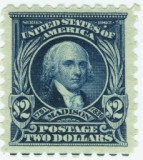
Any of the Washington Head printed by offset press method!
1898
Login to Like
this post
Here is another one that has got to be in the top 10! "The queen was not amused." 
Mauritius

2 Members
like this post.
Login to Like.
And lets not forget this gem. An over-inked Bhor SG1.

2 Members
like this post.
Login to Like.

Is it ugly or just very boring? It is at least very much something from the 1970s.
1 Member
likes this post.
Login to Like.
This one is pretty awful also. I am not sure whether this was intended as a caricature or not but ... yuk

7 Members
like this post.
Login to Like.
05:07:59pm
@JanSimon
That is truly awful! Well done.
But it made me look up "Korfball", a game I had never heard of. (After I Google translated "Korfbad" and wondered how the stamp related to a "basket bath".)
Roy
1 Member
likes this post.
Login to Like.
05:10:47pm
"I am not sure whether this was intended as a caricature or not"
Well, Keith Richards looks pretty true to life! I ran into him once in Toronto -- we used the same dentist.
Great selections. Keep them coming!
Roy
Login to Like
this post
If somebody sent this to me on an envelope, I’d wonder what I did to tick them off! Yuck! That looks like someone about to be sick - ewwwww

1 Member
likes this post.
Login to Like.
This thread is sort of a throw back, to a time when stamp collecting was on the rise:
Gibbons stamp weekly had a contest to "name the 12 ugliest stamps" in 1905.

I have not found the printed results of this contest, but I have seen it reported that the No.1 ugliest was Bundi SG.1 (below). While it may be ugly is also terribly expensive. The example below sold for 30K pounds last December.

Number two in the rankings was a pretty awful twopenny hapence of New South Wales of the late Victorian era, I think 1897 or so (below):

3 Members
like this post.
Login to Like.
Canada have produced many, many beautiful stamps showing Queen Elizabeth II. So where did this one come from ?
I am pretty sure it didn't get 'Royal' approval. It was disliked by many at the time of issue.
I squirm every time I see it !! 
Nice thread ! More to come......

2 Members
like this post.
Login to Like.
This was in my top two ugliest Canadian stamps. This is the other one
A stunningly beautiful, gentle, soft-faced photograph became a shrew-faced stamp. Definitely not an engraver's best work


1 Member
likes this post.
Login to Like.
This one gives me the creeps, every single time I see it. Kids are great, and kid's art is highly interesting and appreciated to me....usually. I don't know who picked the "winners" for this set of Christmas art from kids (1970, scott 524 "Christ child") but sheeesh, the whole set looks creepy to me. Funnt thing is though, I am sure that a great many people really like these stamps. There is no accounting for taste, and there is no arguing "beauty" with anyone.

2 Members
like this post.
Login to Like.
I've never understood why Alan Shepherd didn't sue Paraguay for this set of stamps from the 1960s (unless the visage here is actually supposed to be Wolverine from the X-men)

4 Members
like this post.
Login to Like.
Benque- my hubby and I both agree with you - that is one creepy stamp! Shudder! Those black holes for eyes omg!
3 Members
like this post.
Login to Like.
@Roy: it is really weird how such a vague and abstract design had to celebrate a sport. Korfbal is a typically Dutch sport, invented over here and although it is played in other countries as well, only two countries really take it seriously: the Netherlands and Belgium. Therefore each world championship has the same final: Netherlands vs. Belgium.
Korfbal is one of only very few sports with mixed teams: men and women are playing together in a team.
Here are a few designs that were rejected before coming to the extremely stylized end result.

Login to Like
this post
I was able to locate the results of the 1905 Gibbons Stamp Weekly ugliest contest previously posted. The results not too surprisingly were heavily weighted towards a number of the more primitive Indian States issues. 

3 Members
like this post.
Login to Like.
Here is another winner. I wonder if QE2 even saw some of these questionable efforts? (She did have an impressive collection of stamps.  )
)

They both look startled -- or maybe the image was taken during an argument?
4 Members
like this post.
Login to Like.
And how could we not include this masterpiece???

2 Members
like this post.
Login to Like.
I can't help myself . This one scared me -- yikes.

8 Members
like this post.
Login to Like.
Come on ... I expected an outpouring of ugly (). There is a vast universe of uninspired to downright incompetent designs just waiting for their moment of fame.
So here is another scary one (or maybe just creepy). Leoncavallo was the composer of Pagliacci which if you know anything about opera you will know it features some clowns ...  The clown looking over Leoncavallo's shoulder is kinda scary ...

A real photo of Leoncavallo I think is hard to beat:

The cover of the original score (1892), I think would have made a much better stamp:

2 Members
like this post.
Login to Like.
I always considered this stamp as particularly unappealing.

5 Members
like this post.
Login to Like.
Not great for sure. How about this one along the same line but designed by an actual artist (David Hockney). Probably not something for his greatest hits list?

3 Members
like this post.
Login to Like.
Now for a change of pace, something inspiring -- wait no, probably more like banal, insipid or you pick your favorite pejorative:

3 Members
like this post.
Login to Like.

A postage stamp only a philatelist could love.
2 Members
like this post.
Login to Like.
BuckaCover.com - 80,000 covers priced 60c to $1.50 - Easy browsing 500 categories
07 Aug 2023
03:01:07pm
"Beauty is in the eye of the beholder"
--- attributed to Margaret Wolfe Hungerford (probably paraphrased from Wm. Shakespeare)
Over the years, we have often had threads asking members to post images of their favorite "beautiful" stamps, but what about the "ugly ducklings"? Probably an unfair comparison, since none of them are ever likely to turn into a beautiful swan, regardless of the subjectivity of the selection. But then again, impressionist paintings were originally criticized as being vulgar and childish.
In any case, I believe ugly stamps have had short shrift. They have not had the exposure which they deserve. Let's change that.
There are many candidates. While I have not thought seriously through the various countries and eras, a couple pop into my head unbidden. I offer a first one here to get the ball rolling and challenge other members to
Post an image of an ugly stamp!
Roy
2 Members
like this post.
Login to Like.

re: Ugly stamps?
A classic "ugly," Barwani (India Princely State) SG.16: pretty much the definition of ugly.
2 Members
like this post.
Login to Like.

re: Ugly stamps?
There are many, but this one always comes to my mind as one of the ugliest ones ever thought up;
7 Members
like this post.
Login to Like.
04:00:24pm
re: Ugly stamps?
Any of the Washington Head printed by offset press method!
1898
Login to Like
this post
re: Ugly stamps?
Here is another one that has got to be in the top 10! "The queen was not amused."
Mauritius
2 Members
like this post.
Login to Like.
re: Ugly stamps?
And lets not forget this gem. An over-inked Bhor SG1.
2 Members
like this post.
Login to Like.

Approvals
re: Ugly stamps?
Is it ugly or just very boring? It is at least very much something from the 1970s.
1 Member
likes this post.
Login to Like.
re: Ugly stamps?
This one is pretty awful also. I am not sure whether this was intended as a caricature or not but ... yuk
7 Members
like this post.
Login to Like.
BuckaCover.com - 80,000 covers priced 60c to $1.50 - Easy browsing 500 categories
07 Aug 2023
05:07:59pm
re: Ugly stamps?
@JanSimon
That is truly awful! Well done.
But it made me look up "Korfball", a game I had never heard of. (After I Google translated "Korfbad" and wondered how the stamp related to a "basket bath".)
Roy
1 Member
likes this post.
Login to Like.
BuckaCover.com - 80,000 covers priced 60c to $1.50 - Easy browsing 500 categories
07 Aug 2023
05:10:47pm
re: Ugly stamps?
"I am not sure whether this was intended as a caricature or not"
Well, Keith Richards looks pretty true to life! I ran into him once in Toronto -- we used the same dentist.
Great selections. Keep them coming!
Roy
Login to Like
this post

re: Ugly stamps?
If somebody sent this to me on an envelope, I’d wonder what I did to tick them off! Yuck! That looks like someone about to be sick - ewwwww
1 Member
likes this post.
Login to Like.
re: Ugly stamps?
This thread is sort of a throw back, to a time when stamp collecting was on the rise:
Gibbons stamp weekly had a contest to "name the 12 ugliest stamps" in 1905.
I have not found the printed results of this contest, but I have seen it reported that the No.1 ugliest was Bundi SG.1 (below). While it may be ugly is also terribly expensive. The example below sold for 30K pounds last December.
Number two in the rankings was a pretty awful twopenny hapence of New South Wales of the late Victorian era, I think 1897 or so (below):
3 Members
like this post.
Login to Like.

re: Ugly stamps?
Canada have produced many, many beautiful stamps showing Queen Elizabeth II. So where did this one come from ?
I am pretty sure it didn't get 'Royal' approval. It was disliked by many at the time of issue.
I squirm every time I see it !!
Nice thread ! More to come......
2 Members
like this post.
Login to Like.

re: Ugly stamps?
This was in my top two ugliest Canadian stamps. This is the other one
A stunningly beautiful, gentle, soft-faced photograph became a shrew-faced stamp. Definitely not an engraver's best work
1 Member
likes this post.
Login to Like.
02:50:52am
re: Ugly stamps?
This one gives me the creeps, every single time I see it. Kids are great, and kid's art is highly interesting and appreciated to me....usually. I don't know who picked the "winners" for this set of Christmas art from kids (1970, scott 524 "Christ child") but sheeesh, the whole set looks creepy to me. Funnt thing is though, I am sure that a great many people really like these stamps. There is no accounting for taste, and there is no arguing "beauty" with anyone.
2 Members
like this post.
Login to Like.

re: Ugly stamps?
I've never understood why Alan Shepherd didn't sue Paraguay for this set of stamps from the 1960s (unless the visage here is actually supposed to be Wolverine from the X-men)
4 Members
like this post.
Login to Like.
re: Ugly stamps?
Benque- my hubby and I both agree with you - that is one creepy stamp! Shudder! Those black holes for eyes omg!
3 Members
like this post.
Login to Like.
Approvals
re: Ugly stamps?
@Roy: it is really weird how such a vague and abstract design had to celebrate a sport. Korfbal is a typically Dutch sport, invented over here and although it is played in other countries as well, only two countries really take it seriously: the Netherlands and Belgium. Therefore each world championship has the same final: Netherlands vs. Belgium.
Korfbal is one of only very few sports with mixed teams: men and women are playing together in a team.
Here are a few designs that were rejected before coming to the extremely stylized end result.
Login to Like
this post
re: Ugly stamps?
I was able to locate the results of the 1905 Gibbons Stamp Weekly ugliest contest previously posted. The results not too surprisingly were heavily weighted towards a number of the more primitive Indian States issues.
3 Members
like this post.
Login to Like.
re: Ugly stamps?
Here is another winner. I wonder if QE2 even saw some of these questionable efforts? (She did have an impressive collection of stamps. )
They both look startled -- or maybe the image was taken during an argument?
4 Members
like this post.
Login to Like.
re: Ugly stamps?
And how could we not include this masterpiece???
2 Members
like this post.
Login to Like.
re: Ugly stamps?
I can't help myself . This one scared me -- yikes.
8 Members
like this post.
Login to Like.
re: Ugly stamps?
Come on ... I expected an outpouring of ugly (). There is a vast universe of uninspired to downright incompetent designs just waiting for their moment of fame.
So here is another scary one (or maybe just creepy). Leoncavallo was the composer of Pagliacci which if you know anything about opera you will know it features some clowns ... The clown looking over Leoncavallo's shoulder is kinda scary ...
A real photo of Leoncavallo I think is hard to beat:
The cover of the original score (1892), I think would have made a much better stamp:
2 Members
like this post.
Login to Like.

re: Ugly stamps?
I always considered this stamp as particularly unappealing.
5 Members
like this post.
Login to Like.
re: Ugly stamps?
Not great for sure. How about this one along the same line but designed by an actual artist (David Hockney). Probably not something for his greatest hits list?
3 Members
like this post.
Login to Like.
re: Ugly stamps?
Now for a change of pace, something inspiring -- wait no, probably more like banal, insipid or you pick your favorite pejorative:
3 Members
like this post.
Login to Like.
re: Ugly stamps?
A postage stamp only a philatelist could love.
2 Members
like this post.
Login to Like.