Discussion - Member to Member Sales - Research Center
Discussion - Member to Member Sales - Research Center


03:38:02pm
EDIT: If you decide to pay attention to this blacks, blues and greens can look very similar!

1 Member
likes this post.
Login to Like.
@Harvey
There are some issues with the 1898 Series Revenue Stamps where the blue cancels and green cancels do look very similiar at least to me they do.
I'm not interested in color cancels, more interested in the actual cancel, and doing research on the companies (background).
1898
Login to Like
this post
Harvey,
i pay attention, but most US collectors, in my experience, do not. I had a US #1 where most of the value was supposedly in the cancel. I think I was the only one who cared.
Login to Like
this post
09:36:04pm
The colour would probably be orange, ultramarine, violet or green!! I was an antique dealer for many years and I always understood that book prices were there mainly to boost the ego of the collector. But if I were selling a stamp with a $1000 premium for a certain colour I would at least add on an extra $100.
Login to Like
this post
There are lot of "green" cancels around that are in reality blue. Lots of methods to determine which is which out there but it is still a judgement call.
Another thing to watch out for is all the "pink" #65's on yellow covers.You need to mask the stamp to tell no matter how good it looks.
Login to Like
this post
Sure there are those who value the color of cancels. I would say they tend to be specialists. Just like some have no interest in topicals and others have no interest in fly specking ...
I have looked for one of these I could afford. So far no luck ...

4 Members
like this post.
Login to Like.
I do!
David Giles
Chairman, United States Study Group
Ottawa Philatelic Society
Est. 1891
Canada's Oldest Local Stamp Club
Login to Like
this post
01:35:59pm
Jack, nice stamps! Not really sure but they look like 10A (not sure if 10, 10A or 11 since colors and details on line are tricky) so there would be a $225 bonus for green cancels. The pair is especially nice! They would look nice on my page 1. If my IDs are correct I have 10 and 11 with regular type cancels, those stamps would look nice in the margins!! Here is a previously shown scan of my page 1 with spaces left for #8 and #16 that I'll probably never be able to find at an affordable prices. A couple of those stamps Jack shows would look real nice in the upper left. One of these days maybe I'll find a #13 to finish the page. Sorry the scan is blurry, I had to reduce the pixels to make it load here. And no, I won't show the backsides, not my thing!!

1 Member
likes this post.
Login to Like.
@Harvey
Your eyes must be better than mine, as I did not see the pair, way to go. top drawer catch!
1898
Login to Like
this post
02:47:23pm
You're right 1898, as always, I saw a pair where one did not exist! The similar cancellations on the first two made them look like a pair. My abject apologies!!
Login to Like
this post
The three stamps I posted were all S.11s and three individual stamps. The one on the right was really an Olive green. Tough to find any with a green cancel -- the olive green has a Lancaster, PA cancel and is plated to 100R3.
Login to Like
this post
Below is a S.10 (Orange brown) plated 54R1i with a Blue cancel.

4 Members
like this post.
Login to Like.
03:30:56pm
Great looking stamps!! I only have one stamp with a green cancellation, a cover for #114, thanks to an SOR member. It is no where near as vibrant as the green shown on these stamps! The blue cancellation that you show is very attractive. The couple blue's I've seen are so dark they are almost black. I have two with red cancels, a #37 (lilac grey, I think!) and a #37a (grey, with certificate), and the red, even though not as rare as the green, is very striking as well!
Edit: Sorry, I forgot that my #1 on my shown page 1 has a red cancellation which, according to the book, adds $400 to the price - as if!! But regardless of price it adds something to the stamp!
Edit#2 Here's an interesting article on plating the 3 cent stamp. https://www.stampplating.com/colors
Login to Like
this post
I think red cancels on an S.37 are eye catching. Mine below:

4 Members
like this post.
Login to Like.
04:11:17pm
Great looking stamp, thanks for showing! The other thing I like, even though most people look at it almost like it damages the stamp, is pen cancellation. I think it makes the stamp more personal. My #11 has a nice pen cancel but I really think it livens up the early revenue stamps! There's a couple really nice ones on this page I showed in another post earlier. Also the colours of some of these early revenues are quite impressive, the oranges, blues, greens and browns.

Login to Like
this post
04:19:21pm
One other question! I've just lately started on a small collection of one precancel per state and I don't think I've ever seen a precancel done in any other colour than black. Do other colours exist for precancels?
Login to Like
this post
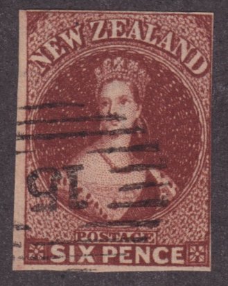
Here's one of which is it right and proper color, sometimes looks Blue and then sometimes it looks Green to me.
1898

Login to Like
this post
"Do other colours exist for precancels?"
I know nothing about precancels but all the ones I have seen are black.
Login to Like
this post
This is the best colored cancel I own -- S.147 with an orange New York combined with a blackish bullseye and something. But I am not 100% certain it is genuine. I have seen New York cancels of this period that are orange, so I know it may be OK but I have been meaning to send it for a cert but have not gotten around to it yet. Opinions?

Login to Like
this post
10:13:59pm
If genuine you just added a $750 premium to a $2 stamp. It looks fine to me but maybe a certificate would add to your certainty!! Great looking stamp, a very colorful addition to a normally very dull stamp!
Login to Like
this post
I guess I'm an old fashion collector, if the stamp is used, that's good enough for me, what difference does the color of the cancellation does?
This is one that someone would love, a bicolor cancellation, is it black over red or red over black?

3 Members
like this post.
Login to Like.
Back when I had a bunch! I think, therefore I am - I think! Descartes, sort of!
21 Jul 2023
03:38:02pm
The Scott's specialized catalogs, for early US stamps, lists the premiums given for various colors of cancellations. Most of us really couldn't care less but in some cases this can add hundreds of dollars onto the "book values" of the stamps. I'm wondering how many of the US collectors out there even pay attention to this. I bought a cover a while ago where the fact that it had a green cancellation supposedly added $400 to the value. I note that sort of thing next to the stamp or cover. Does anyone else bother?
EDIT: If you decide to pay attention to this blacks, blues and greens can look very similar!
1 Member
likes this post.
Login to Like.
04:10:03pm
re: colors of cancels!
@Harvey
There are some issues with the 1898 Series Revenue Stamps where the blue cancels and green cancels do look very similiar at least to me they do.
I'm not interested in color cancels, more interested in the actual cancel, and doing research on the companies (background).
1898
Login to Like
this post

Auctions
re: colors of cancels!
Harvey,
i pay attention, but most US collectors, in my experience, do not. I had a US #1 where most of the value was supposedly in the cancel. I think I was the only one who cared.
Login to Like
this post
Back when I had a bunch! I think, therefore I am - I think! Descartes, sort of!
21 Jul 2023
09:36:04pm
re: colors of cancels!
The colour would probably be orange, ultramarine, violet or green!! I was an antique dealer for many years and I always understood that book prices were there mainly to boost the ego of the collector. But if I were selling a stamp with a $1000 premium for a certain colour I would at least add on an extra $100.
Login to Like
this post
06:34:56am
re: colors of cancels!
There are lot of "green" cancels around that are in reality blue. Lots of methods to determine which is which out there but it is still a judgement call.
Another thing to watch out for is all the "pink" #65's on yellow covers.You need to mask the stamp to tell no matter how good it looks.
Login to Like
this post

re: colors of cancels!
Sure there are those who value the color of cancels. I would say they tend to be specialists. Just like some have no interest in topicals and others have no interest in fly specking ...
I have looked for one of these I could afford. So far no luck ...
4 Members
like this post.
Login to Like.

re: colors of cancels!
I do!
David Giles
Chairman, United States Study Group
Ottawa Philatelic Society
Est. 1891
Canada's Oldest Local Stamp Club
Login to Like
this post
Back when I had a bunch! I think, therefore I am - I think! Descartes, sort of!
22 Jul 2023
01:35:59pm
re: colors of cancels!
Jack, nice stamps! Not really sure but they look like 10A (not sure if 10, 10A or 11 since colors and details on line are tricky) so there would be a $225 bonus for green cancels. The pair is especially nice! They would look nice on my page 1. If my IDs are correct I have 10 and 11 with regular type cancels, those stamps would look nice in the margins!! Here is a previously shown scan of my page 1 with spaces left for #8 and #16 that I'll probably never be able to find at an affordable prices. A couple of those stamps Jack shows would look real nice in the upper left. One of these days maybe I'll find a #13 to finish the page. Sorry the scan is blurry, I had to reduce the pixels to make it load here. And no, I won't show the backsides, not my thing!!
1 Member
likes this post.
Login to Like.
01:43:11pm
re: colors of cancels!
@Harvey
Your eyes must be better than mine, as I did not see the pair, way to go. top drawer catch!
1898
Login to Like
this post
Back when I had a bunch! I think, therefore I am - I think! Descartes, sort of!
22 Jul 2023
02:47:23pm
re: colors of cancels!
You're right 1898, as always, I saw a pair where one did not exist! The similar cancellations on the first two made them look like a pair. My abject apologies!!
Login to Like
this post
re: colors of cancels!
The three stamps I posted were all S.11s and three individual stamps. The one on the right was really an Olive green. Tough to find any with a green cancel -- the olive green has a Lancaster, PA cancel and is plated to 100R3.
Login to Like
this post
re: colors of cancels!
Below is a S.10 (Orange brown) plated 54R1i with a Blue cancel.
4 Members
like this post.
Login to Like.
Back when I had a bunch! I think, therefore I am - I think! Descartes, sort of!
22 Jul 2023
03:30:56pm
re: colors of cancels!
Great looking stamps!! I only have one stamp with a green cancellation, a cover for #114, thanks to an SOR member. It is no where near as vibrant as the green shown on these stamps! The blue cancellation that you show is very attractive. The couple blue's I've seen are so dark they are almost black. I have two with red cancels, a #37 (lilac grey, I think!) and a #37a (grey, with certificate), and the red, even though not as rare as the green, is very striking as well!
Edit: Sorry, I forgot that my #1 on my shown page 1 has a red cancellation which, according to the book, adds $400 to the price - as if!! But regardless of price it adds something to the stamp!
Edit#2 Here's an interesting article on plating the 3 cent stamp. https://www.stampplating.com/colors
Login to Like
this post
re: colors of cancels!
I think red cancels on an S.37 are eye catching. Mine below:
4 Members
like this post.
Login to Like.
Back when I had a bunch! I think, therefore I am - I think! Descartes, sort of!
22 Jul 2023
04:11:17pm
re: colors of cancels!
Great looking stamp, thanks for showing! The other thing I like, even though most people look at it almost like it damages the stamp, is pen cancellation. I think it makes the stamp more personal. My #11 has a nice pen cancel but I really think it livens up the early revenue stamps! There's a couple really nice ones on this page I showed in another post earlier. Also the colours of some of these early revenues are quite impressive, the oranges, blues, greens and browns.
Login to Like
this post
Back when I had a bunch! I think, therefore I am - I think! Descartes, sort of!
22 Jul 2023
04:19:21pm
re: colors of cancels!
One other question! I've just lately started on a small collection of one precancel per state and I don't think I've ever seen a precancel done in any other colour than black. Do other colours exist for precancels?
Login to Like
this post
08:36:37pm
re: colors of cancels!
Here's one of which is it right and proper color, sometimes looks Blue and then sometimes it looks Green to me.
1898
Login to Like
this post
re: colors of cancels!
"Do other colours exist for precancels?"
I know nothing about precancels but all the ones I have seen are black.
Login to Like
this post
re: colors of cancels!
This is the best colored cancel I own -- S.147 with an orange New York combined with a blackish bullseye and something. But I am not 100% certain it is genuine. I have seen New York cancels of this period that are orange, so I know it may be OK but I have been meaning to send it for a cert but have not gotten around to it yet. Opinions?
Login to Like
this post
Back when I had a bunch! I think, therefore I am - I think! Descartes, sort of!
22 Jul 2023
10:13:59pm
re: colors of cancels!
If genuine you just added a $750 premium to a $2 stamp. It looks fine to me but maybe a certificate would add to your certainty!! Great looking stamp, a very colorful addition to a normally very dull stamp!
Login to Like
this post

re: colors of cancels!
I guess I'm an old fashion collector, if the stamp is used, that's good enough for me, what difference does the color of the cancellation does?
This is one that someone would love, a bicolor cancellation, is it black over red or red over black?
3 Members
like this post.
Login to Like.